Stock charts promise clarity in a world of noise, but the moment you mistake a chart pattern for certainty, you’ve invited a bias to the party. The goal isn’t to memorize every indicator or chase every flicker on the screen; it’s to build a reliable way to interpret data without letting human psychology steer you off course. In this guide, you’ll learn how to read charts thoughtfully, recognize common cognitive traps, and develop routines that keep your decisions grounded in evidence rather than mood or habit. If you’re curious about the broader question of how to read charts without being misled, you may also encounter the Polish formulation Jak czytać wykresy giełdowe i nie paść ofiarą błędów poznawczych?—a reminder that the core challenge crosses languages and markets.
What stock charts show and how to read them at a glance
Charts are a distilled representation of price action over time. They summarize trades into a visual story: where buyers and sellers agreed to transact, how aggressively they did so, and where energy seemed to build or fade. The first step in reading any chart is to identify the basic canvas you’ll rely on. Are you looking at a line chart that highlights closing prices, a bar chart that reveals daily highs and lows, or a candlestick chart that paints a fuller picture of momentum within the period?
Line charts give you a clean sense of direction. They remove intraday noise and focus on the overall trajectory. Bar charts and candlesticks add nuance: you can see whether the price closed higher or lower than it opened, and in candlesticks you can gauge the strength of the move by the body size and wick length. As a reader, you should ask a few grounded questions: What is the trend on multiple time frames? Do volume levels confirm or contradict the price move? Are there obvious support and resistance zones where price repeatedly stalls or reverses?
Don’t panic if all this sounds technical at first. Start with the big picture and then layer in detail. Treat chart reading like a story with acts: the setup (trend and context), the move (price action and momentum), and the consequence (likely outcomes and risk). A practical habit is to write down a single hypothesis before you inspect the chart—something like: “I expect the stock to bounce off this support, with volume confirming stronger hands at the bid.” That simple stance anchors your subsequent observations and helps prevent wandering conclusions.
Common cognitive biases that distort chart interpretation
When you spend hours watching a chart, your brain develops shortcuts to speed up judgment. Some shortcuts are useful; others are dangerous. The danger lies in treating a subjective impression as objective truth. Here are the biases to watch for, along with quick reminders to counter them:
- Confirmation bias: seeking evidence that supports your preconceptions while ignoring data that contradicts them. Counter by actively seeking counterpoints and testing them with objective criteria.
- Anchoring: placing too much emphasis on a single price level or date. Counter by re-evaluating anchor points in light of broader data, not just the moment you first noticed them.
- Recency bias: giving outsized weight to the most recent moves. Counter by evaluating longer horizons and the full context of prior swings.
- Availability heuristic: overweighing what happened recently because it’s fresh in memory. Counter by calibrating expectations with historical ranges and standard deviations.
- Patternicity: seeing patterns where the data doesn’t support them, a form of overfitting. Counter by testing patterns against out-of-sample data and acknowledging when evidence is weak.
- Sunk cost fallacy: continuing a plan because you’ve already spent time or capital, rather than because it makes sense now. Counter by appraising the current setup on its own merits, not on past commitments.
These biases don’t disappear with knowledge alone. They recede only when you adopt deliberate routines that force you to question assumptions and seek objective checks. A key antidote is to separate signal from noise: not every wiggle in price is meaningful, and not every meaningful move is actionable. Training your eye to distinguish structure from randomness is a skill you build, not a talent you possess.
Strategies to counter biases: building a robust observation routine
The most effective antidote to cognitive bias is a dependable process. A disciplined routine creates a repeating standard for how you observe charts, argue your case, and decide what to do next. Here are practical steps that you can apply even if you’re just building your trading or investing habit.
First, define your hypothesis before you look. Start every session with a short, testable statement about what you expect to happen, given the chart’s current context. For example: “If the price breaks above the 50-day moving average with rising volume, I expect the move to continue at least until the next resistance level.” This precommitment disciplines your attention and makes it easier to evaluate outcomes honestly, whether or not the trade or investment works out.
Second, use a lightweight checklist. A minimal, consistent checklist helps you gather essential data without drowning in detail. A simple version might include: trend direction on multiple time frames, key support and resistance levels, volume confirmation, momentum signals (like RSI or MACD), and risk metrics (position sizing, stop placement, and maximum acceptable drawdown). If the checklist makes no meaningful prediction, you have a signal to pause and reassess—rather than to overfit the moment.
Third, separate process from outcome. It’s easy to celebrate a win or beat yourself up after a loss, but the value lies in the process, not the result. If your process was followed correctly—predefined criteria met or not met—that’s a successful day, even if the position turned out differently than you hoped. Journal your observations with dates, criteria, and notes about what you learned. Over time, the journal becomes a map of what consistently works for you and what doesn’t.
Fourth, incorporate a risk-managed exit mindset. Bias often hides in the exit. A decision to sell based on a tiny nudge from a chart is a sign you might be chasing improvement after the fact. Instead, rely on predefined stop rules, trailing stops tied to volatility, or a time-based exit if the rationale changes. Clear exit criteria reduce the mental friction that fuels impulsive decisions.
Technical tools that help you stay objective
Technological tools won’t replace your discipline, but they can reinforce it. The right combination of indicators, chart types, and automated checks can help you separate meaningful signals from random noise. Here are practical tools you’ll likely encounter and how they can support a bias-aware approach.
Moving averages smooth out price data and help reveal the prevailing trend. Short-term averages respond quickly; longer-term averages filter out day-to-day noise. A common tactic is to compare the positions of short- and long-term averages to gauge trend strength and potential crossovers. However, don’t treat a crossover as a guaranteed signal—consider volume, volatility, and whether the move aligns with your broader plan.
Momentum indicators, such as the Relative Strength Index (RSI) or the Moving Average Convergence Divergence (MACD), quantify how fast prices are moving and whether they’re overbought or oversold. They’re useful as components of a broader checklist, not as stand-alone buy or sell triggers. Pair momentum with price levels and volume to avoid chasing momentum that lacks confirmation.
Volume patterns add a crucial layer of context. Price moves on light volume can be fragile, while high-volume moves at key price levels often carry more persistence. Use volume as a companion evidence to price, not as a standalone signal. If a breakout occurs on thin volume, treat it as a potential warning rather than a confirmed breakout.
Support and resistance levels anchor your risk management. These zones aren’t precise lines; they’re areas where the balance of buyers and sellers tends to shift. Confirm a breakout or breakdown with additional signals—such as a change in volume, the behavior of adjacent price bars, or momentum indicators—before committing capital.
Seasoned traders often augment with volatility measures like the Average True Range (ATR) to gauge how far prices might move in a given period. A wider ATR implies bigger potential moves and the need for larger risk buffers. Use ATR to adjust position size and stop placement, ensuring your plan remains proportional to market temperament.
While these tools are valuable, the real power lies in how you integrate them into a consistent workflow. A chart is a map, not a prophecy. The map is only useful if you use it in a way that respects your risk tolerance, time horizon, and the specific asset you’re studying.
Practical routine: from a plan to daily observation
Consistency is the backbone of learning to read charts without bias. Build a practical routine that travels with you, not a theoretical dream that lives only in your head. Here’s a functional blueprint that many readers find helpful, adaptable to stocks, ETFs, or futures.
Start your session with a quick reset. Clear distractions, pull up the instrument you’re monitoring, and refresh the data feed. Revisit your prewritten hypothesis and checklist. If your hypothesis no longer holds due to new information, adjust transparently and note the change in your journal. The goal is to remain honest with yourself at every turn.
Next, inspect price action through multiple lenses. Check the trend on a longer timeframe to set the context, then zoom into a shorter timeframe to confirm or question the immediate setup. If the longer view contradicts a recent breakout, pause and test potential reasons—e.g., a one-time event, a change in market sentiment, or a temporary liquidity issue. This cross-check acts as a natural guardrail against overinterpreting a single data slice.
Then run through your checklist. Mark the presence or absence of each item and assign a confidence level to your overall read. If the confidence is middling, consider waiting for additional confirmation or reducing position size. When the checklist aligns with your risk framework, you’ve earned a grounded entry, not a rushed decision.
Finally, document your outcome and what you learned. The distance between intention and outcome often reveals your cognitive blind spots. For example, you might notice you became more optimistic after a series of favorable trades, which highlights a tendency toward confirmation bias. A concrete note like “saw a bullish pattern but the volume didn’t confirm; next time I’ll wait for volume to pick up before acting” is a powerful corrective for future sessions.
Navigating real-life scenarios: learning from mistakes
Consider a scenario where a trader spots a rapid price ascent after a period of stagnation. The rush to join the rally can be fueled by recency bias and the allure of a quick gain. If the trader also uses a single indicator without corroboration, the decision becomes highly fragile. A well-structured reader would pause, check the underlying fundamentals, examine volume, test for a breakdown of price stability in nearby markets, and assess whether the move aligns with the broader trend. If the evidence doesn’t fit, the prudent move is often to stay out or reduce exposure until clarity emerges.
In another scenario, a supposed breakout fails to hold above a resistance zone with little follow-through in volume. A biased reader might declare the breakout valid because it occurred recently, ignoring the lack of volume and the history of false breakouts at that level. An unbiased routine would require another signal to confirm persistence, such as a second consecutive close above resistance on higher volume or a supportive cross of momentum indicators. This approach protects against the naive interpretation of “one good day” becoming a new reality.
You’ll also encounter situations where multiple signals clash. The chart might show a bullish moving-average cross, yet the RSI hints at overbought conditions. A bias-aware reader doesn’t pick sides solely on one signal. Instead, they weigh the combination of signals, the context, and the risk attached to the trade. They may decide to wait for a more concise alignment or to adopt a scaled-in approach, reducing risk while the puzzle pieces converge.
Real-world tools and resources that sharpen your eye
In practice, access to data and education matters as much as discipline. Here are practical resources and habits that can help you stay sharp without getting overwhelmed. Remember, the goal is to improve your process, not to accumulate indicators for their own sake.
- Educational courses that emphasize chart reading as part of a broader investing framework.
- Mentor or peer groups where you present your charts, hypotheses, and outcomes for feedback.
- A reliable charting platform with clean, fast data and the ability to customize indicators without clutter.
- A trading journal or note-taking app where you document hypotheses, signals, decisions, and outcomes.
- Regular reviews of past trades to identify bias-driven missteps and to calibrate your plan accordingly.
When selecting tools, favor simplicity and transparency over complexity. A clean interface that aligns with your checklist will be more effective than a feature-rich platform that tempts you to chase new signals. The best tools are those that help you stay disciplined, not those that promise certainty in every market condition.
Concrete examples: a simple table to compare chart types
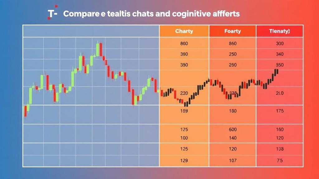
To make the ideas concrete, here’s a compact comparison of common chart types and what they tend to reveal. Use this as a quick reference rather than a definitive guide to trading decisions.
| Chart type | What it emphasizes | Strengths | Limitations |
|---|---|---|---|
| Line chart | Closing prices over time | Clear trend direction; simplicity | Lacks intraday detail; misses price action nuances |
| Bar chart | Open, high, low, close (OHLC) | More price action than line; intuitive for intraday moves | Can be visually busy; still lacks volume context |
| Candlestick chart | Body and wick information, intra-period momentum | Rich visual cues for momentum and reversals | Can encourage pattern chasing if read in isolation |
As you study these options, remember that no chart type is a crystal ball. Each form is a tool to illuminate a facet of price action. Your job is to pick the tool that best serves your plan, not the tool that looks most exciting on paper.
Practical tips for long-term habit formation
Reading charts well is less about clever ideas and more about dependable routines. Here are several habits that reinforce objectivity over time.
First, schedule regular reviews. A weekly session to audit your signals, outcomes, and biases helps you detect drift before it becomes a pattern. A quarterly deep-dive into your most successful and most costly trades reveals which biases still creep in and which safeguards actually worked.
Second, pursue small, repeatable bets. Instead of attempting grand predictions, practice with modest exposure and clear stop rules. This reduces the emotional pull of “being right” and shifts focus toward disciplined execution.
Third, embrace humility. Markets evolve, and no single framework remains perfect forever. When you encounter a situation that tests your beliefs, treat it as data rather than a referendum on your intelligence. A humble reader adapts, rather than doubles down, when facts point elsewhere.
Fourth, diversify your references. Read market commentary, but balance it with primary data—the price action itself. If opinions consistently diverge from your observations, reexamine your sources or adjust your decision framework to rely more on your checklist and less on external narratives.
Putting it all together: your ongoing practice
The journey from staring at charts to interpreting them with disciplined judgment is iterative. You’ll start with simple questions and gradually layer in more nuanced checks. Your bias-detection muscle strengthens as you document missteps and refine your checklist. Over time, your reading becomes less about chasing the next flashy signal and more about understanding the underlying dynamics that sustain price movement.
One practical way to keep momentum is to pair a daily habit with a weekly savoring of broader market context. Each day you review a chart, and each week you step back to consider macro factors, sector trends, and liquidity conditions. This balance helps you keep your feet on the ground while your eyes scan the horizon for meaningful shifts.
As you advance, you’ll notice a quiet but powerful shift: patterns become informative rather than magical. You’ll recognize the difference between a well-supported breakout and a speculative burst. You’ll accept that not every signal will converge, and that is okay. The health of your approach depends on consistency, transparency, and a willingness to revise when the data demands it.
For readers who are bilingual or curious about cross-cultural perspectives, you may find it enriching to reflect on the familiar question Jak czytać wykresy giełdowe i nie paść ofiarą błędów poznawczych? from a Polish-speaking trader’s vantage point. The core challenge is universal: how to translate data into action without letting the mind’s shortcuts hijack the process. The antidote—structure, evidence, and thoughtful skepticism—translates across markets and languages alike.
In the end, the art of reading stock charts responsibly is as much about psychology as it is about math. A chart is a conversation between price and time, and your job is to listen with open ears and a disciplined mind. Treat every chart as a prompt, not a prophecy, and you’ll steadily reduce the upside and downside of cognitive biases. Progress comes in small, repeatable steps—chart by chart, day by day, with humility as your compass and a solid process as your map.
So, take a moment to set your plan, check your biases at the door, and begin again with fresh eyes. The market isn’t asking you to be perfect; it’s inviting you to be consistent, thoughtful, and resilient. When you build that habit, you’ll find that reading charts becomes less about chasing certainty and more about improving your understanding of how prices move—and why they move when they do.